
Dithering is one of those visual effects you have probably seen hundreds of times without knowing its name.
It appears in early computer graphics, retro video games, risograph-inspired posters, grainy album artwork and experimental digital design. From a distance, a dithered image can appear smooth and detailed. Look closer, however, and you will see that the image is built from carefully arranged dots, pixels or repeated patterns.
Originally, dithering was used to overcome technical limitations. Early screens and printers could only display a small number of colours, so designers and engineers needed a way to suggest colours and shades that were not actually available.
Today, those limitations have mostly disappeared, but the look remains popular. Designers now use dithering intentionally to add texture, character and a distinctly digital quality to otherwise clean imagery.
What Is Dithering?
Dithering is a technique that uses patterns of available colours to create the appearance of additional colours, shades or gradients.
Imagine that you only have black and white pixels available, but you want to create a middle grey. You cannot display grey directly, so instead you place black and white pixels next to each other in a controlled pattern.
From close up, the individual pixels remain visible. From further away, your eyes blend them together and interpret the pattern as grey.
The same principle can be applied across a full image. Areas that need to appear darker contain more dark pixels. Lighter areas contain fewer. By changing the density and arrangement of those pixels, dithering can recreate shadows, gradients and photographic detail using a very limited palette.
Why Was Dithering Invented?
Dithering became especially important during the early years of digital graphics.
Older computers, games consoles and display systems could only show a small selection of colours at one time. Images with smooth gradients or subtle shadows would often produce visible bands where one available colour suddenly changed into another.
Dithering helped soften these transitions.
Instead of displaying solid blocks of two neighbouring colours, the system could mix them together through a pattern. This created the illusion of an intermediate shade and made images feel more detailed than the hardware technically allowed.
The technique was also used in printing, where dots of ink could be varied in size, density or placement to simulate continuous tones.
Is Dithering the Same as a Halftone?
Dithering and halftoning are closely related, but they are not exactly the same.
Both techniques use small visual elements to create the illusion of tone. The main difference is usually how those elements are organised.
A halftone image commonly uses regularly spaced dots that change in size. Larger dots create darker areas, while smaller dots create lighter areas. This is strongly associated with commercial printing, newspapers and comic books.
Dithering usually works with pixels or marks of a consistent size. Instead of changing their scale, it changes how frequently and where they appear.
In practice, designers often combine the two aesthetics, particularly in posters, editorial graphics and experimental typography.
Common Types of Dithering
There is no single dithering style. Different methods distribute pixels in different ways, producing noticeably different results.
Ordered dithering
Ordered dithering uses a repeating grid or matrix to decide where pixels should appear.
The result often has a structured, geometric texture. Depending on the settings, the pattern may resemble a checkerboard, dot grid or crosshatch.
Because the pattern repeats, ordered dithering tends to feel clean, controlled and deliberately digital. It works well for bold graphics, pixel-inspired artwork and designs where the texture should remain visible.
Error diffusion dithering
Error diffusion creates a more irregular and organic pattern.
When a colour is simplified, the difference between the original colour and its replacement is passed to neighbouring pixels. This distributes the visual error across the image rather than concentrating it in one place.
Floyd-Steinberg dithering is one of the best-known examples.
Error diffusion usually preserves more photographic detail than a simple ordered pattern. It can produce natural-looking gradients, but it also creates a recognisable scattered texture.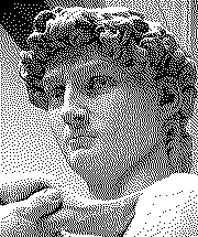
Random dithering
Random dithering places pixels according to brightness while introducing an element of randomness.
This can create rougher, noisier and less predictable results. It often feels more handmade or distressed than ordered dithering.
Random patterns can work especially well for music artwork, clothing graphics, experimental posters and designs that benefit from a less polished finish.
Colour dithering
Dithering does not need to be limited to black and white.
A colour image can be reduced to a carefully selected palette, with neighbouring colours arranged to suggest tones that are no longer directly available.
This can create visuals that feel nostalgic, screen-printed or inspired by early computer graphics. The character of the result depends heavily on the chosen palette.
Why Do Designers Still Use Dithering?
Modern displays can reproduce millions of colours, so dithering is rarely required in the way it once was.
Its continued popularity is largely aesthetic.
It adds texture
Perfect digital gradients can sometimes feel too smooth or sterile. Dithering introduces visible structure into an image and gives flat colour transitions more energy.
It can make a background feel tactile without relying on a photographic texture.
It creates a retro digital look
Dithering is strongly connected to early computers, games and digital publishing.
Even when applied to a modern photograph, it can immediately suggest old software interfaces, low-resolution graphics or early internet imagery.
This makes it particularly useful for Y2K, cyber, pixel-art and retro-futurist design styles.
It simplifies complex images
A photograph may contain millions of individual colours. Dithering allows that image to be reduced to a much smaller palette while keeping important details recognisable.
This can help unify an image with the rest of a design system or make it easier to reproduce using limited colours.
It creates contrast between digital and organic elements
A highly detailed portrait can feel very different once converted into a visible pixel pattern.
That contrast can make the image feel more graphic and less photographic, allowing it to sit more naturally beside typography, vector shapes and bold layouts.
It gives designs a clear visual identity
Dithering is more distinctive than simply adding noise.
Because it transforms the structure of the image, it can become a consistent visual device across posters, social graphics, websites, packaging and campaign assets.
Where Can Dithering Be Used?
Dithering works best when it supports the overall direction of a project rather than being added as decoration at the end.
Common uses include:
- Poster and flyer design
- Album and single artwork
- Editorial illustrations
- Social media graphics
- Website backgrounds
- Fashion and merchandise graphics
- Motion design
- Game-inspired interfaces
- Experimental typography
- Limited-colour printing
It can be applied to an entire image, but often the strongest results come from using it selectively.
For example, a designer might dither only the shadows of a portrait, one section of a gradient or a single background element. This preserves clarity while still introducing the texture.
How to Create a Good Dithered Image
Applying a dithering filter is easy. Creating a result that looks intentional requires more consideration.
Start with a strong image
Dithering will not rescue an image with weak composition or unclear contrast.
Images with a clear subject, defined lighting and strong tonal separation usually produce better results. Portraits, product shots and bold silhouettes are particularly effective.
Adjust contrast before dithering
If the original image is very flat, the dithered result may appear muddy.
Increasing contrast can help separate highlights, midtones and shadows before the colour information is reduced. However, pushing it too far may remove useful details.
Consider the final size
A pattern that looks subtle at full resolution may become invisible once the image is reduced for social media.
The reverse is also true. A very coarse dither can overwhelm a large-format design.
Test the effect at the actual size where it will be viewed.
Choose the right pattern
Ordered patterns feel precise and graphic. Error diffusion feels more photographic. Random dithering feels rougher and more expressive.
The best option depends on the surrounding typography, colour palette and intended mood.
Limit the palette deliberately
Reducing colours is one of the most important parts of the process.
A black and white dither creates maximum contrast. A two-colour palette can connect the image to a brand or campaign. A slightly larger palette preserves more detail while retaining the processed appearance.
Choose colours that belong to the wider design rather than accepting the first automatic result.
Avoid unnecessary detail
Dithering already adds a large amount of visual information. Combining it with too many textures, effects and decorative elements can make the design difficult to read.
Give the pattern room to work.
Common Dithering Mistakes
One of the most common mistakes is applying the effect at such a fine scale that it simply looks like noise.
Dithering should normally have enough structure to feel intentional. If the individual marks are barely visible, the result may lose the character that makes the technique interesting.
Another mistake is using dithering on every element. Text, images, gradients and backgrounds do not all need the same treatment. Keeping some areas sharp creates contrast and helps preserve hierarchy.
It is also worth checking readability. Dithered backgrounds can interfere with small text, especially when both contain similar levels of contrast.
Finally, avoid treating every retro effect as interchangeable. Dithering, halftones, scanlines, film grain and compression artefacts each have their own visual language. Combining them can work, but only when there is a clear reason.
How to Dither an Image Online with FrameSpace
FrameSpace’s Dither Lab gives you a focused workspace for experimenting with dithered image effects directly in your browser.
Rather than building the effect manually, you can test different visual treatments, adjust the image and explore how alternative dithering approaches change the final result.
It is useful for quickly turning photographs, artwork and design assets into graphics with a more textured, limited-colour or retro-digital appearance.
Because Dither Lab sits alongside the other FrameSpace design tools, you can use it as part of a wider workflow. An image could be compressed, converted, recoloured or composed into a larger design without relying on a complicated desktop setup.
Is Dithering Right for Your Project?
Dithering is most effective when its character suits the message.
It can make a design feel technical, nostalgic, raw, experimental or deliberately imperfect. It can also bring consistency to mixed photographic assets by placing them all within the same visual system.
It may be less suitable when photographic realism, soft luxury or complete visual clarity is the priority.
The goal is not to use dithering simply because it looks interesting. The goal is to use its texture and history to strengthen the direction of the design.
Final Thoughts
Dithering began as a workaround for limited technology, but it has developed into a flexible creative technique.
It can reduce a photograph to a handful of colours, turn a smooth gradient into a visible pattern or give a modern composition the character of early digital graphics.
Used carefully, it adds much more than noise. It changes how an image is constructed and how it feels.

