Font Usage Guide: How to Choose and Use Fonts in Graphic Design
Typography is one of the most powerful tools in a designer's toolkit. The fonts you choose affect readability, brand perception, and visual hierarchy. Whether you're working on a logo, a social post, or a full brand identity, getting your font choices right makes a real difference.
Understanding Font Categories
Serif Fonts Traditional letterforms with small strokes at the ends of each character. Great for editorial layouts, heritage brand logos, and long-form body text. Examples: Georgia, Garamond, Merriweather.
Sans-Serif Fonts Clean and modern with no decorative strokes. The standard choice for UI design, tech brands, and minimalist aesthetics. Examples: Inter, Helvetica, Montserrat.
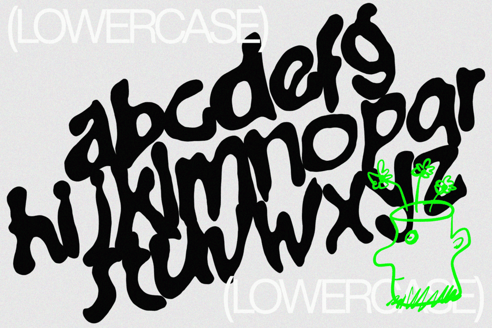
Display and Decorative Fonts High personality, low versatility. Use these for headlines and hero text only, never body copy. Examples: Bebas Neue, Playfair Display, hand-lettered styles.
Monospace Fonts Every character takes equal width. Perfect for code snippets, tech-forward branding, or a retro aesthetic. Examples: Courier, Space Mono, JetBrains Mono.
Font Pairing: What Works and Why
Good font pairing creates contrast without chaos. A few principles that hold up in practice:
- Pair a serif with a sans-serif, one for headlines and one for body text
- Stick to two typefaces per design, three if you have a clear reason
- Vary weight before introducing a new font. Bold vs Regular of the same typeface is often more refined than adding a third
- Avoid pairing two fonts with similar personalities, they will compete rather than complement
A reliable starting combination: Playfair Display for headlines, Source Sans Pro for body text.
Typographic Hierarchy: Guiding the Reader
Hierarchy tells the reader where to look first. Every design should have at least three clear levels:
- Headline — Largest and most attention-grabbing
- Subheading — Supporting context, clearly secondary
- Body copy — Comfortable reading size, 16px minimum for screen
Consistent hierarchy is what separates designs that feel polished from those that feel busy.
Sizing and Spacing
- Line height: Aim for 1.4 to 1.6 times your font size for body text
- Letter spacing: Increase it slightly on uppercase text, keep it tight on large display type
- Kerning: Always check letter pairs manually on display text, some combinations need a nudge
Choosing Fonts for Different Projects
- Brand identity: Prioritise distinctiveness and scalability. Test at small sizes before committing.
- UI and UX design: Legibility comes first. Stick to system-friendly sans-serifs.
- Social media graphics: Bold, high-contrast choices that read instantly at any size.
-
Print and editorial: Serifs work well here. Consider how ink renders at different weights.
Where to Find Good Fonts
The best place to start is FrameSpace. It gives you access to a curated library of fonts built specifically for graphic design work, so you can browse, preview, and apply typefaces directly within your projects without jumping between tools.
For additional free options, Google Fonts and Adobe Fonts are worth bookmarking. If you need something more distinctive for commercial work, Fontspring and MyFonts have extensive libraries with clear licensing. Always check the licence before using any font in client work.